Stories
News, stories, and in-depth features on the artists, makers, organizations, and trends shaping the craft community.
You are now entering a filterable feed of Articles.
354 articles
-
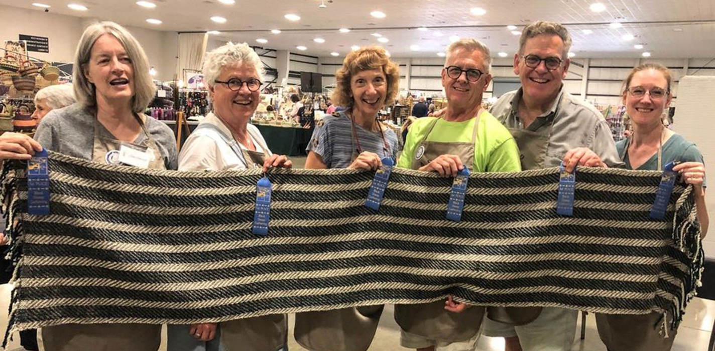
Spinning Tradition Forward in Small-Town Oregon
The Aurora Colony Handspinners keeps traditional fiber arts alive in a community known for its utopian history.
Digital Only
Fiber & Textiles -
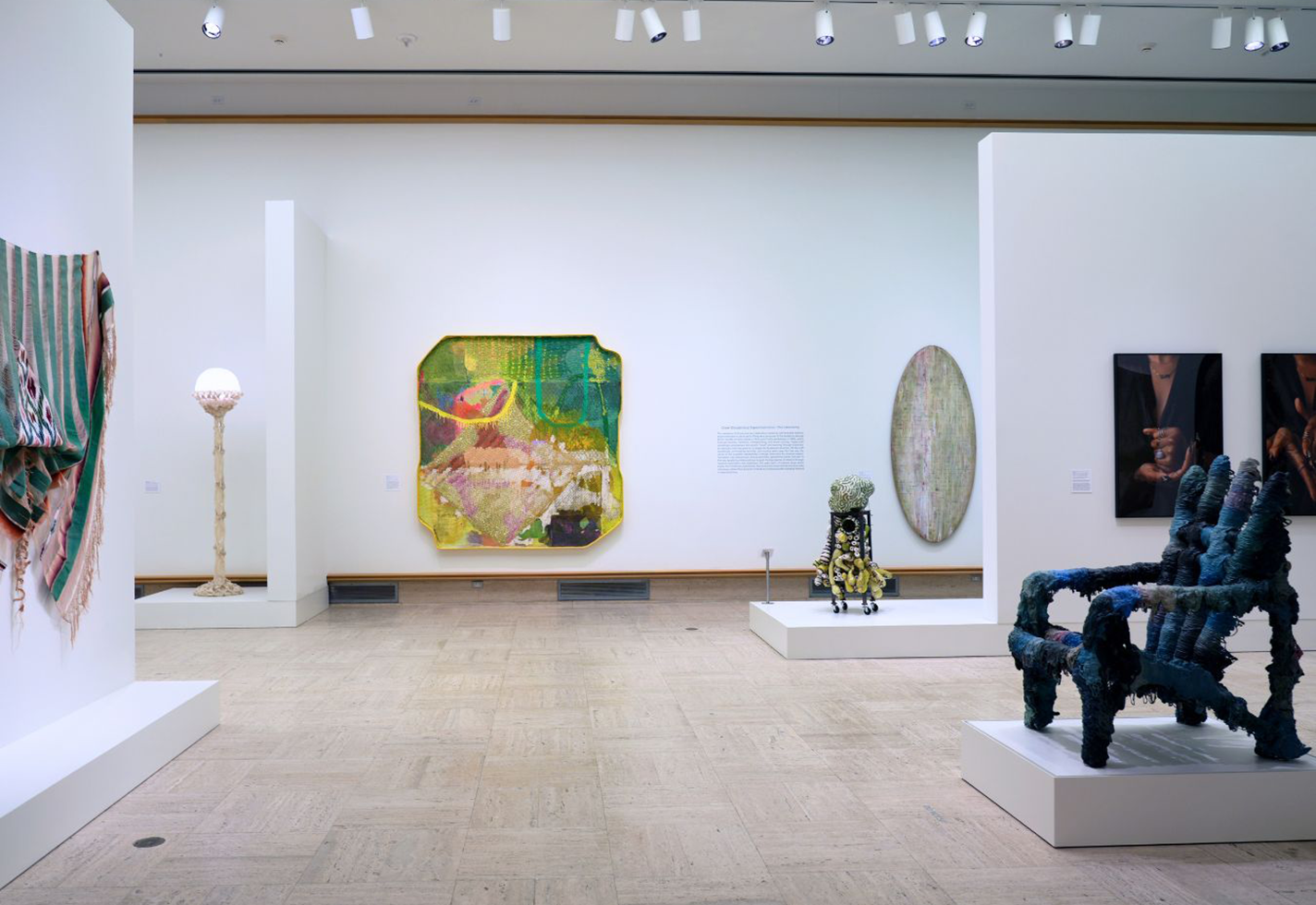
A New Exhibition Takes Cranbrook Visitors into the Labyrinth
Works by alumni and faculty of the Cranbrook Academy of Art comprise a new exhibition at the affiliated Cranbrook Art Museum in Michigan.
Digital Only
CeramicsExhibitionsFiber & TextilesFurnitureGlassMetalMixed MediaWood -
Craft and This Moment
The American Craft Council's executive director shares her thoughts on craft in moments of upheaval and turmoil.
Digital Only
Craft industry -
The Queue: Thomas Campbell
The imposing works of Thomas Campbell are marriages of industrial metalwork and fine craftsmanship.
Digital Only
Metal -
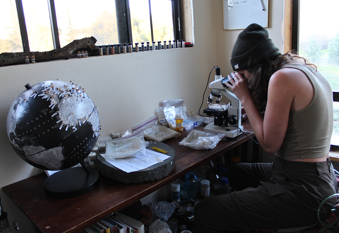
A Ceramist’s Obsession With Sand
Ariana Kier, a San Diego potter and researcher, finds connections to place through the soil.
Digital Only
Ceramics -
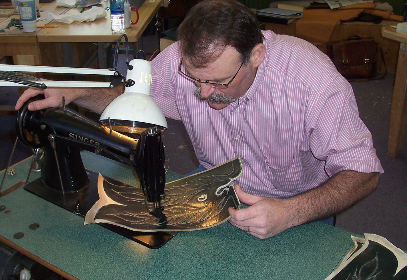
Stitch by Stitch, Side by Side
In a Montana workshop, husband-and-wife team Dan and Julia Schwarz build custom cowboy boots and pass on the skills of the trade.
Digital Only
Fiber & Textiles -
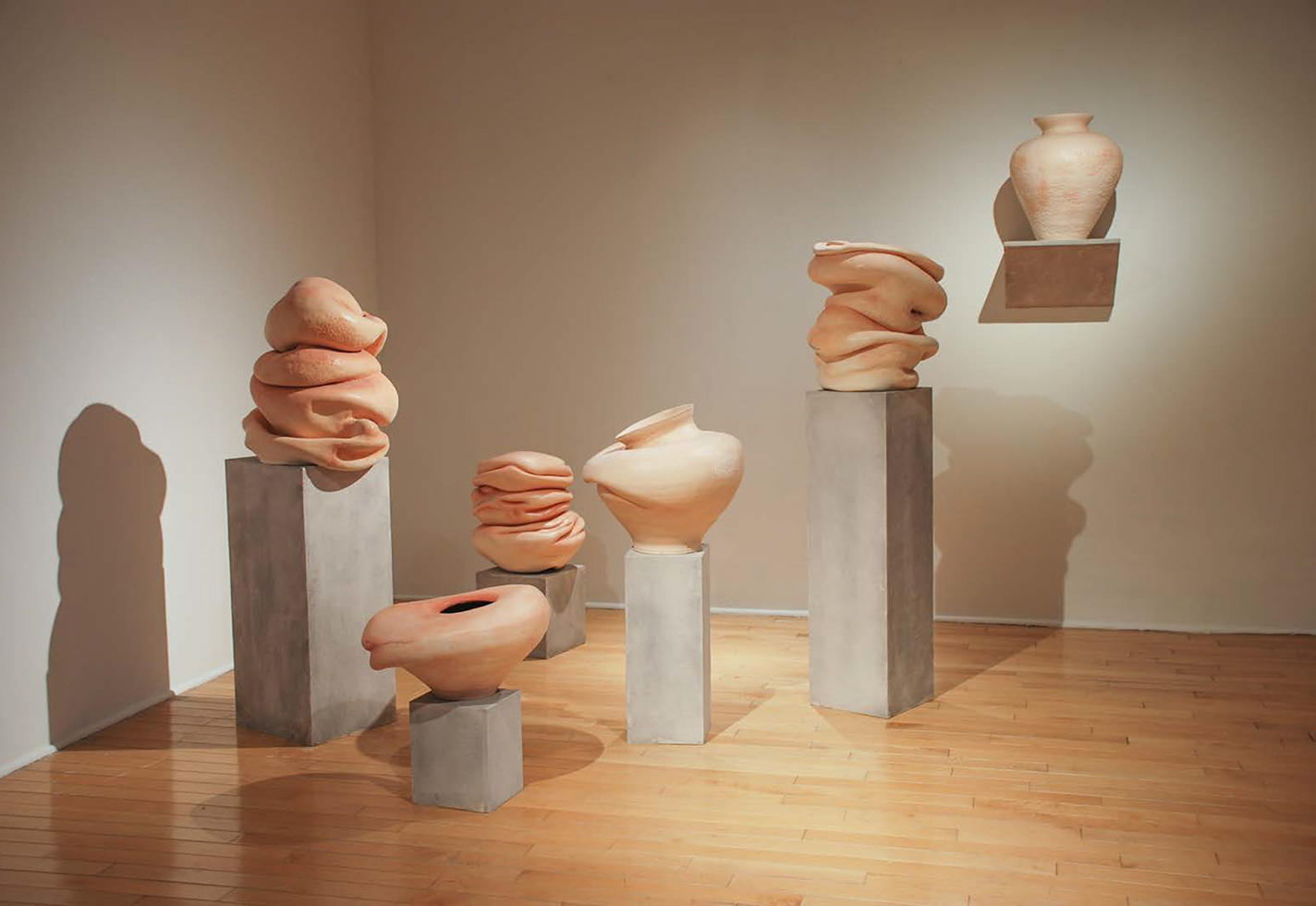
Kelly Devitt’s Clay Bodies Invite Touch
The Iowa ceramist and educator channels pregnancy, motherhood, the physical manifestation of emotion into her unusual clay figures.
Digital Only
Ceramics -
Josh Simpson Shoots for the Moon
The latest project from the veteran glass artist aims to make glass—and habitats for human life—from lunar soil.
Digital Only
Glass -
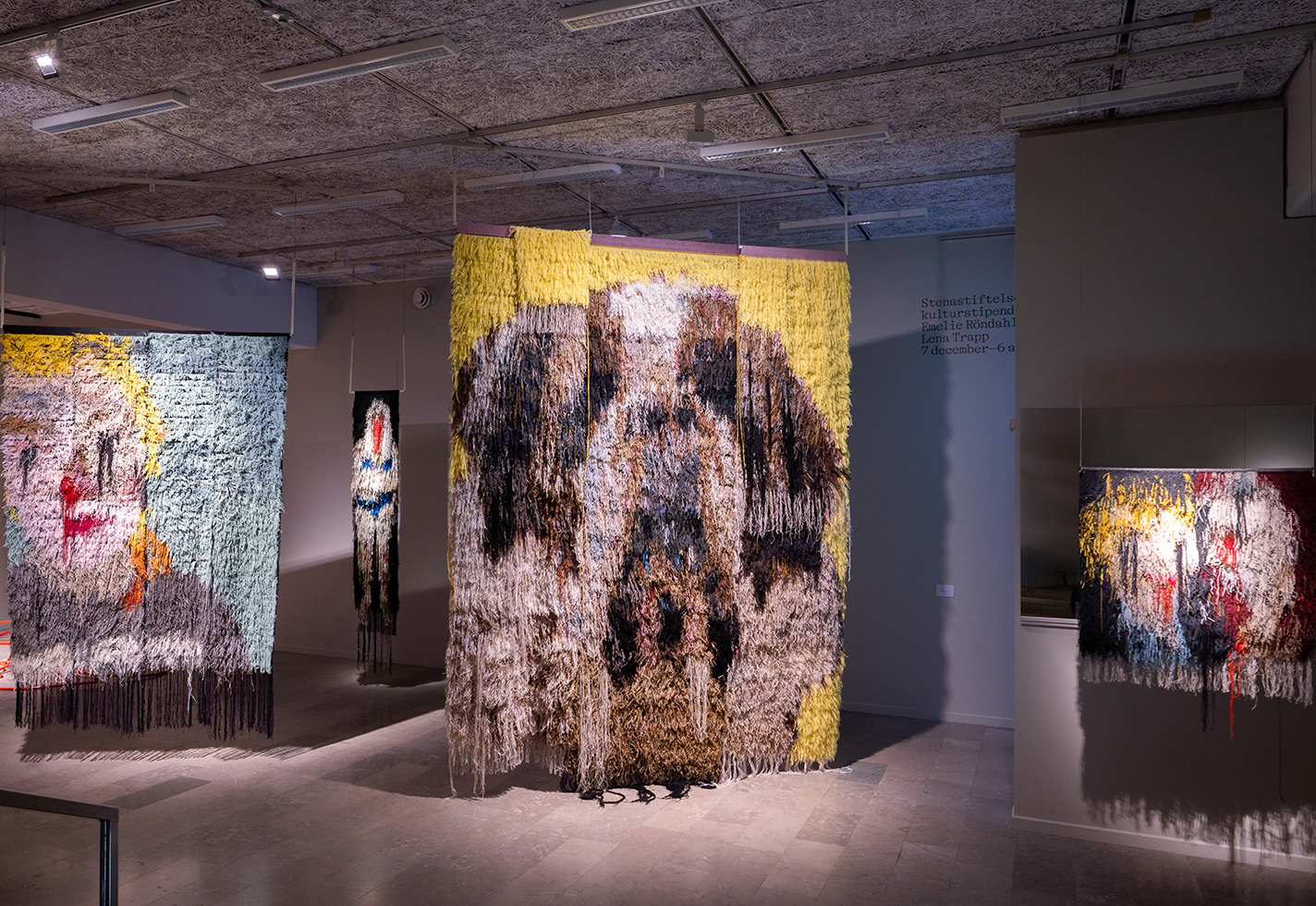
The Rough and the Smooth
Emelie Röndahl's tackles the personal and the political in her rya weavings.
Digital Only
Fiber & Textiles -
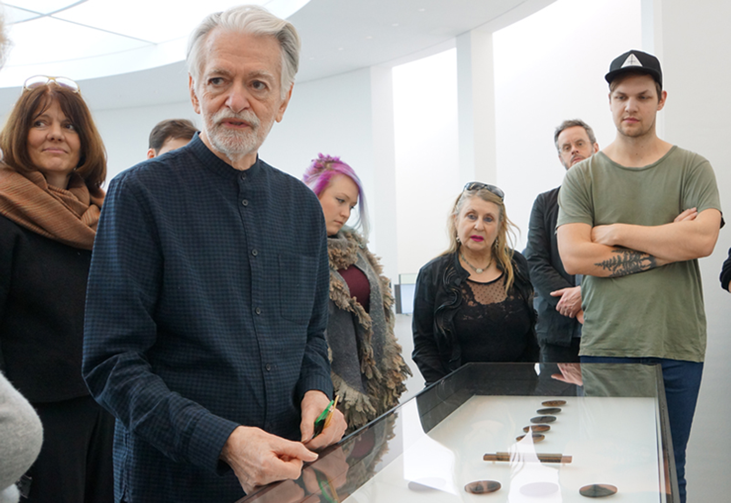
In Memoriam: Thomas Gentille
The American Craft Council remembers 2018 Fellow Thomas Gentille, who passed away earlier this month.
Digital Only
Jewelry -
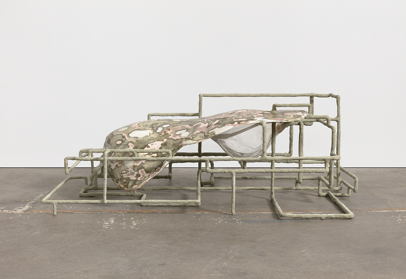
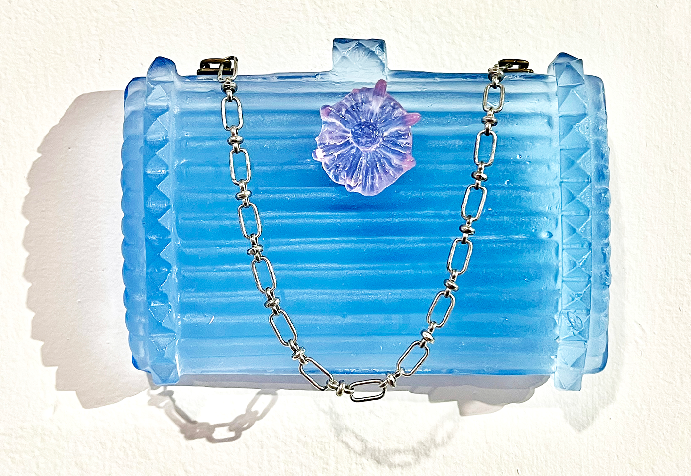
Jes Fan’s Material Explorations
The Brooklyn-based sculptor and glass artist's new show at the Yale University Art Gallery surveys their diverse body of work.
Digital Only
Glass -
A New Lecture and Demonstration Series Dives into the History of Glass
Forged in Fire, a six-part series at Tacoma, Washington’s Museum of Glass, examines the history of American glassmaking through live programming.
Digital Only
EducationEvents -
In Detroit, Unity in Glass
Habatat Galleries' annual celebration of glass aims to provide a balm during tumultuous times.
Digital Only
ExhibitionsGlass -
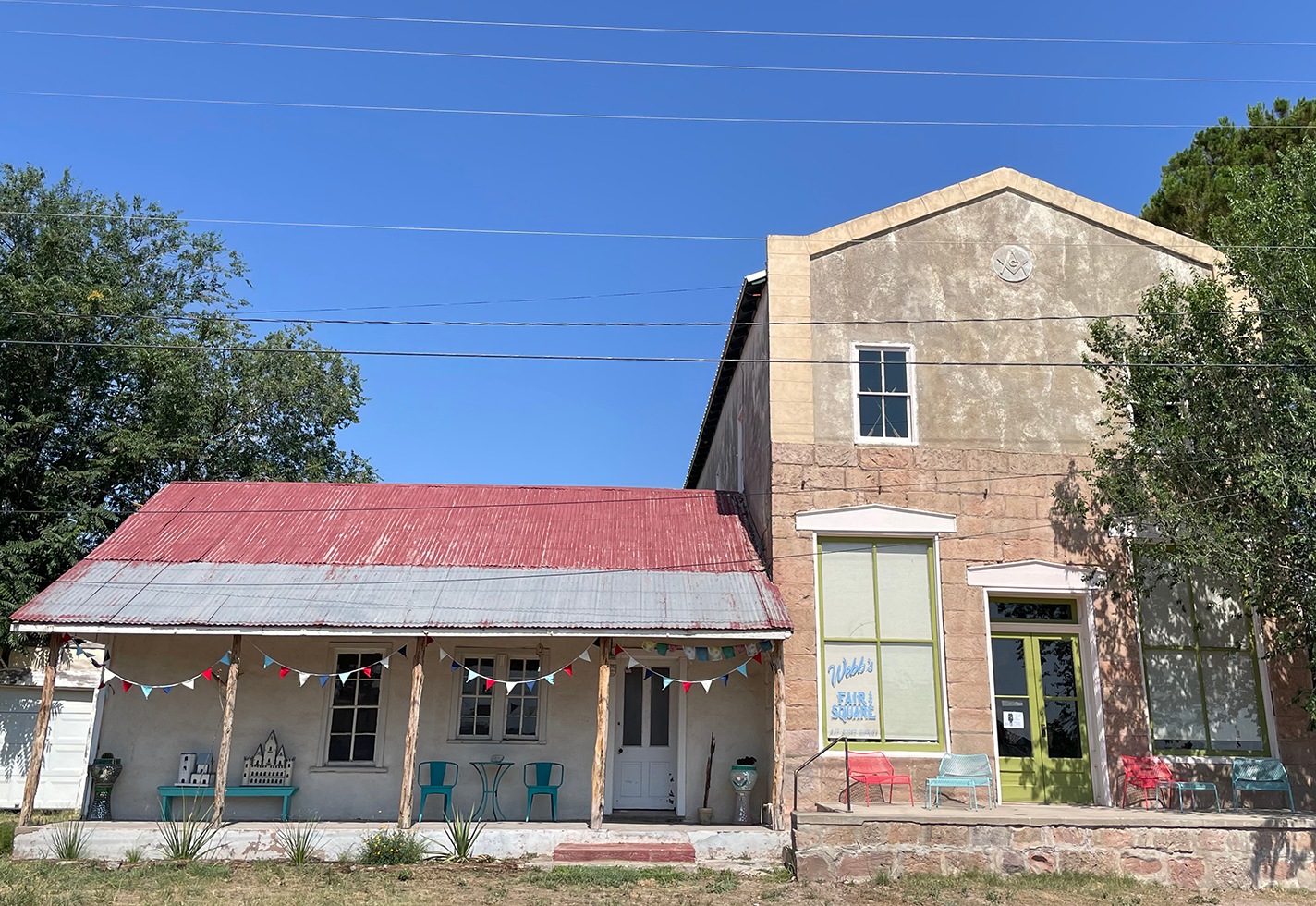
Webb’s Fair and Square Brings Folk Art to the Desert
A new exhibition by textile artist Leigh Kvetko at the West Texas gallery casts an eye on the Southwest’s stark landscapes.
Digital Only
Fiber & Textiles -
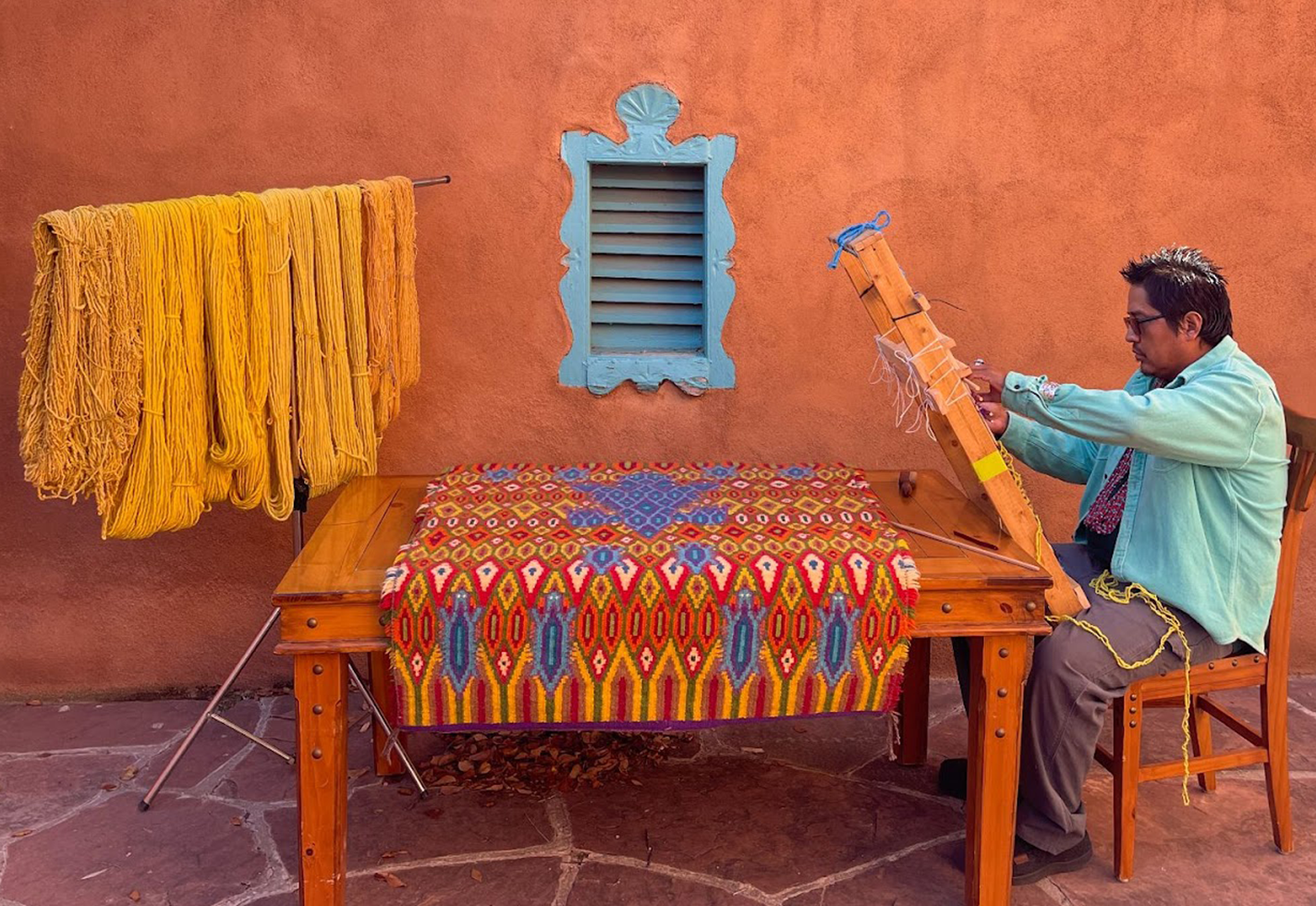
The Kaleidoscopic World of Kevin Tsosie
The Diné artist and sheepherder works from sheep to loom to weave colorful textiles.
Digital Only
Fiber & Textiles -
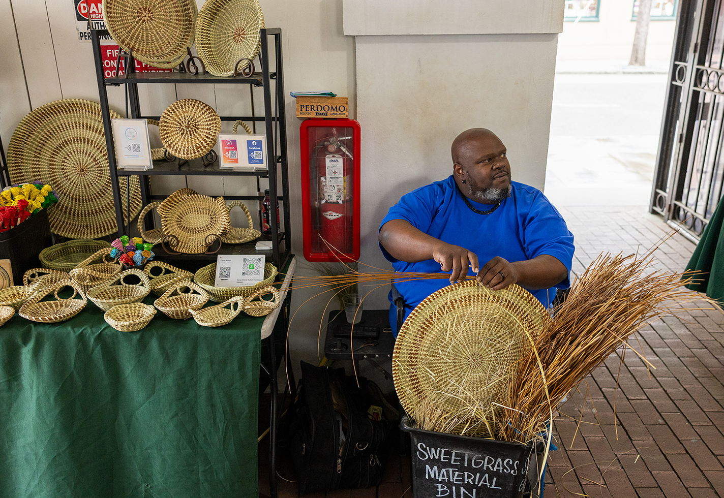
Big Percy Dwarfs the Competition
Corey Alston’s new life-sized sweetgrass basket might be the biggest ever made.
Digital Only
BasketryFiber & Textiles -
Craft-itarianism Focuses on Craft That Sustains
The Center for Craft’s new exhibition emphasizes social practice in craft.
Digital Only
Exhibitions -
A New Kentucky Residency Offers Space for Exploration and Dialogue
The new short-term artist-in-residence program at Berea College Student Craft welcomes working craftspeople.
Digital Only
Craft industryEducation -
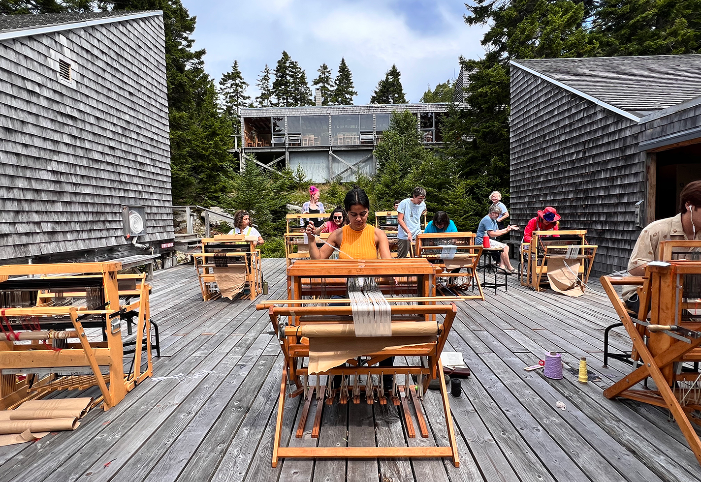
Speakers Converge Across the East Coast in Honor of Haystack Mountain
Voices from the past and present will commingle for storied craft school’s Distinguished Speaker Series.
Digital Only
Education -
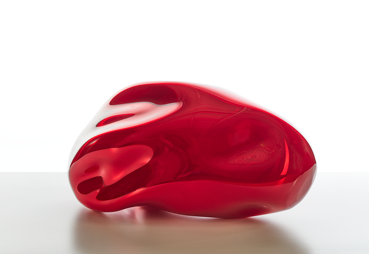
In a New Exhibition, A Novel Pairing of Glass and Monumental Paintings
A first-of-its-kind exhibition at Minnesota’s Cafesjian Art Trust Museum expands the canon of abstract art.
Digital Only
Glass -
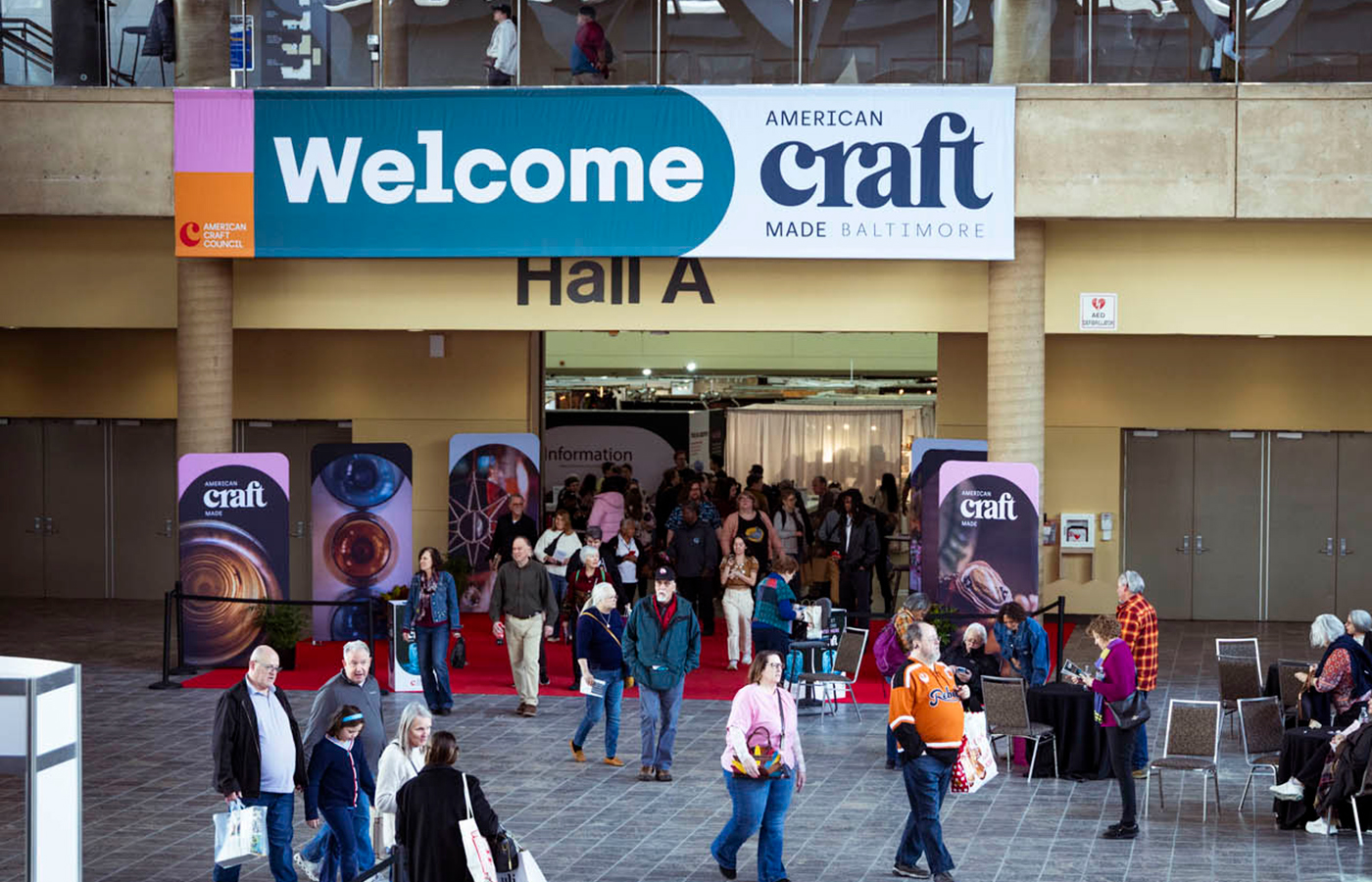
American Craft Made Baltimore 2026: Building Toward 50 Years
The 49th American Craft Made Baltimore, held February 20–22, 2026, was more than a marketplace—it was a powerful demonstration of what’s possible when community and creativity come together.
Digital Only
-
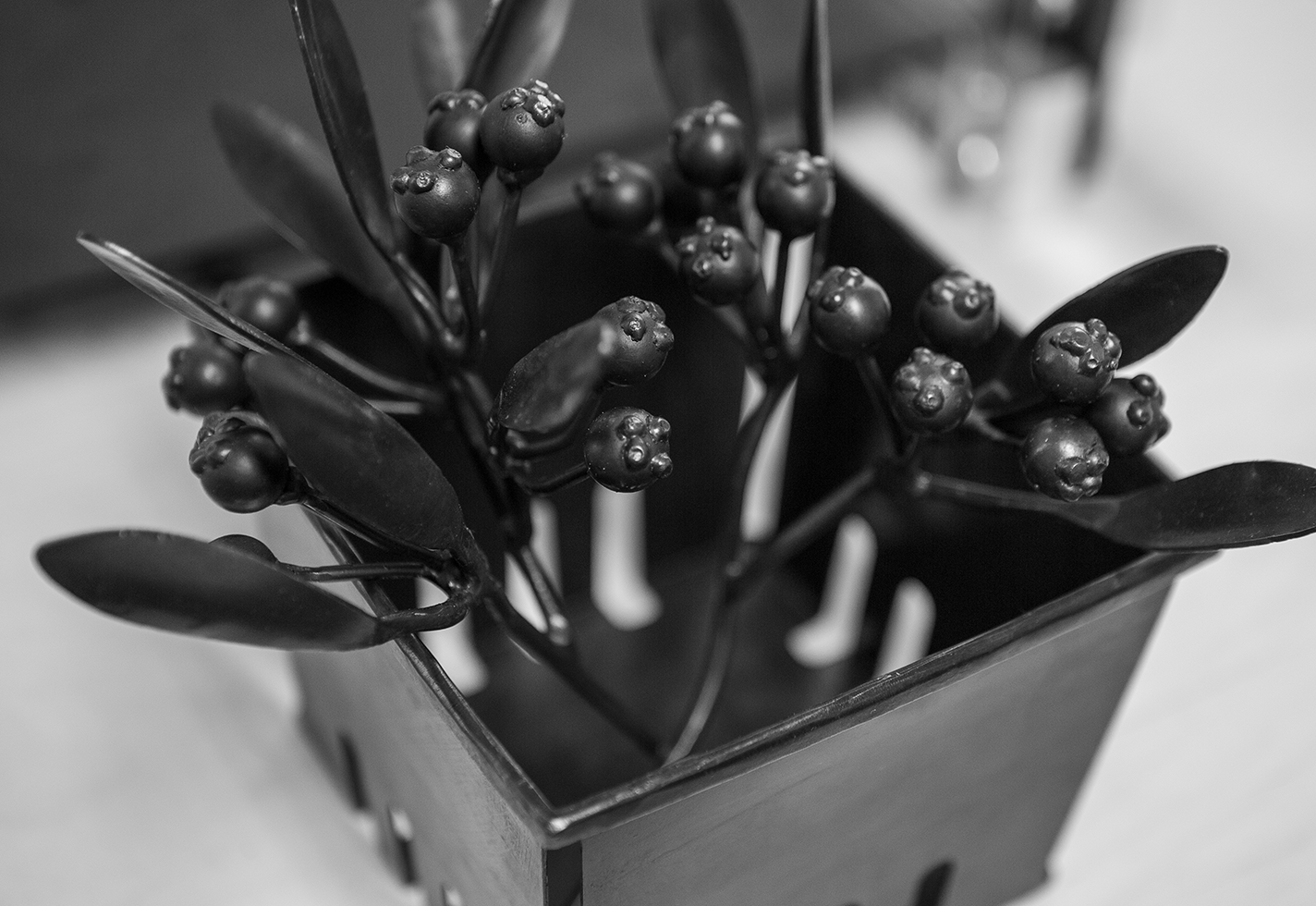
The Queue: Margaret Jacobs
Margaret Jacobs’s organic forms in steel and brass draw on influences from her Akwesasne Mohawk heritage.
Digital Only
JewelryMetal -
Explore Craft Around the Country with ACC’s Regional Craft Correspondents
The four writer-artists of ACC’s new program take readers deep into their region’s craft scene.
Digital Only
-
Handwork 2026 is a National Celebration of Craft 250 Years in the Making
Arts organizations find community, partnership, and collaboration through Craft in America’s landmark initiative.
Digital Only
EventsExhibitions
Story categories.
-
Craft News
Timely, topical stories on the artists, makers, and organizations shaping the craft field.
-
Interviews & Profiles
Inspiration and insight from and about makers.
-
Features & Essays
Expert voices dig deep into craft-related subjects.
-
Craft Around the Country
Regional craft reporting and storytelling.
-
Craft Media
Books, periodicals, videos, and podcasts highlighting craft.
Take part.
Become a member of ACC.
Craft is better when we experience it together. Support makers, celebrate the handcrafted, and explore the nationwide craft community with a membership to the American Craft Council.
