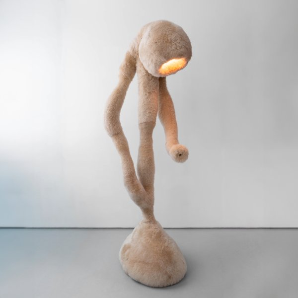
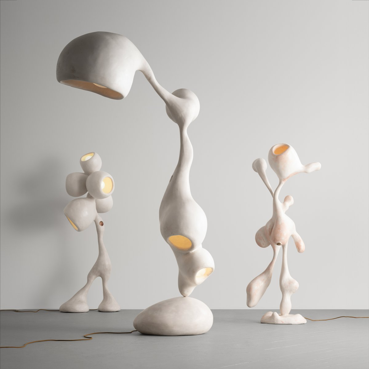
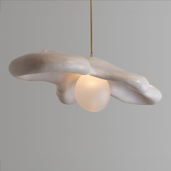
Sinuous and sensual, the honed gypsum floor lamp that graces the cover of the Winter 2024 issue of American Craft was coaxed to life by Rogan Gregory in his sun-washed primary studio in Santa Monica, California. Like much of Gregory’s work, this untitled, illuminated sculpture from his Fertility Form series has an organic presence that animates the interior landscape while bridging the gap between art object and functional furniture.
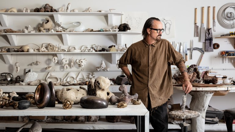
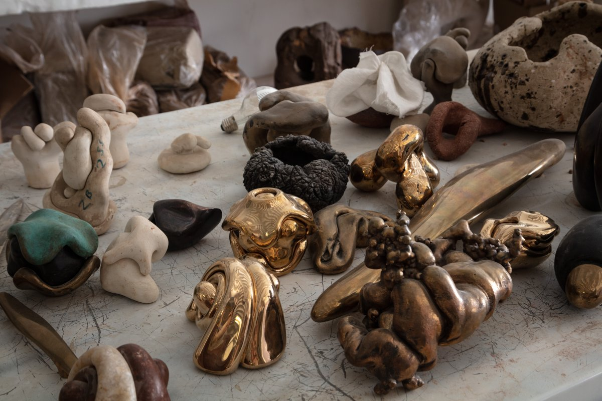
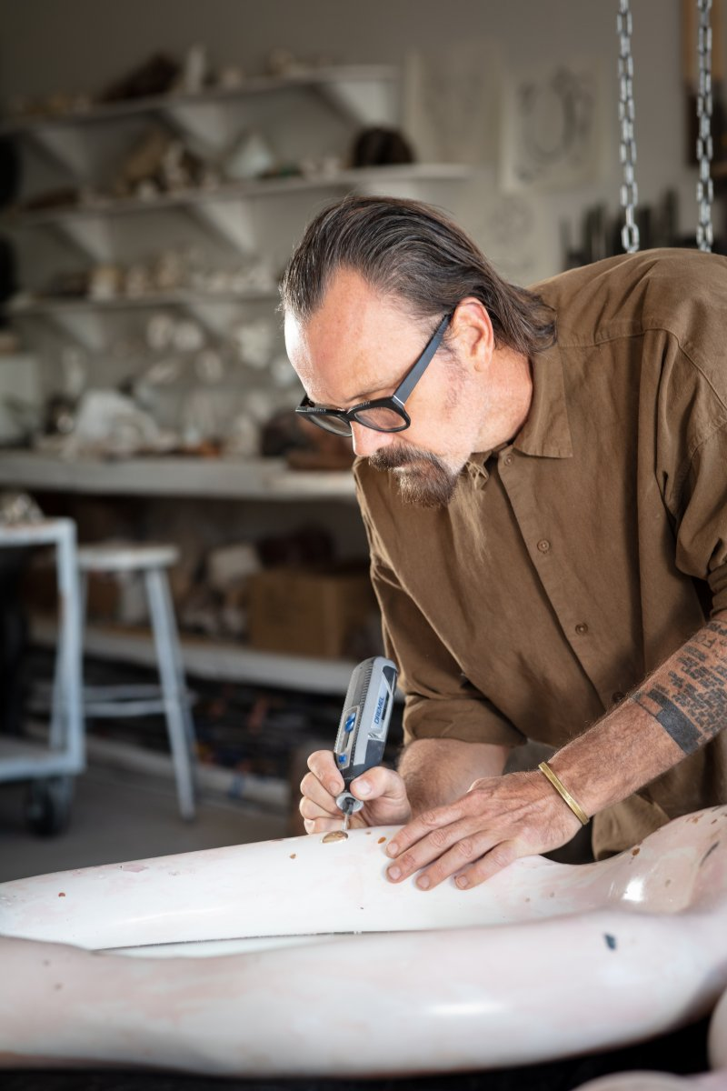
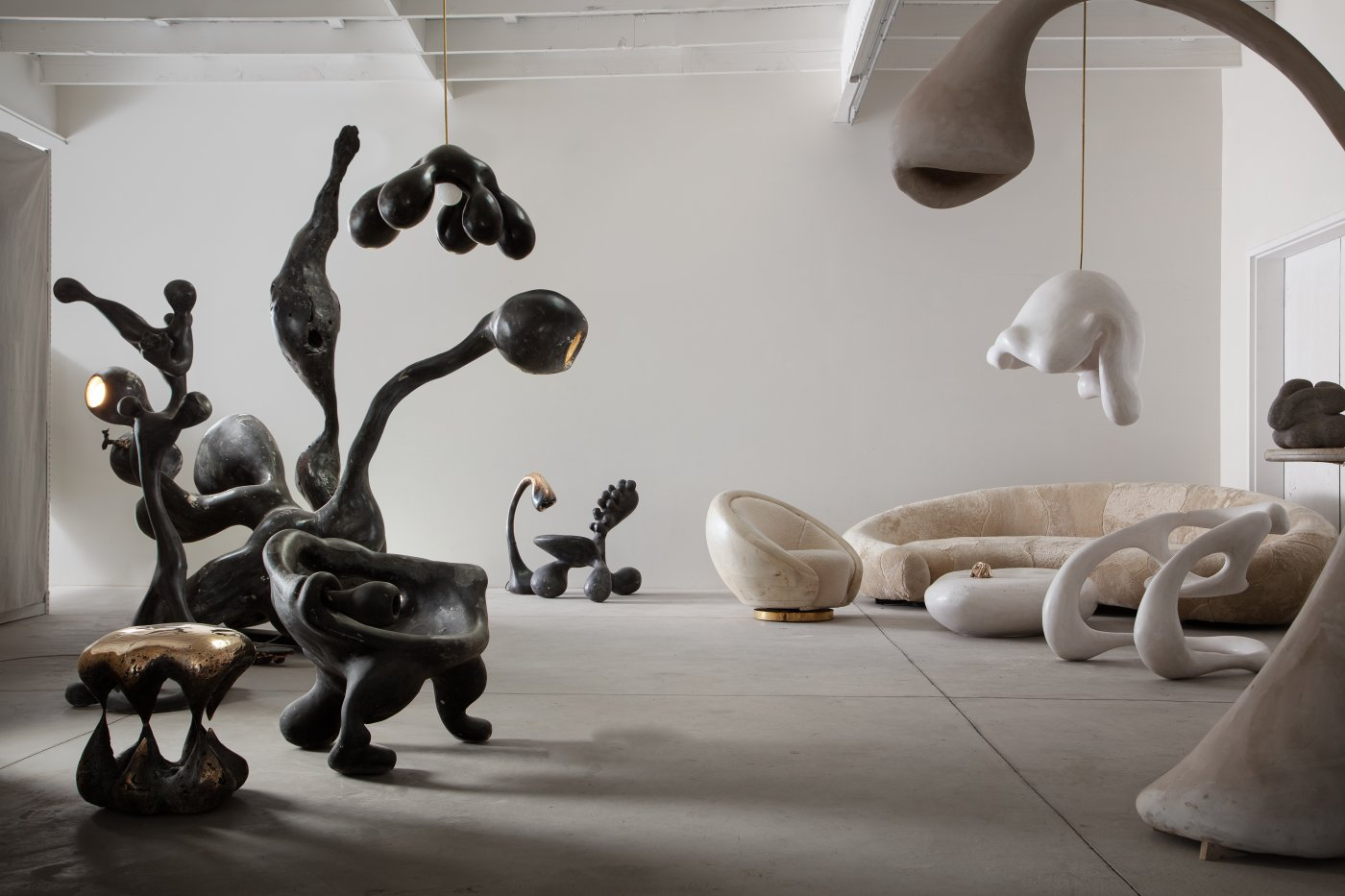
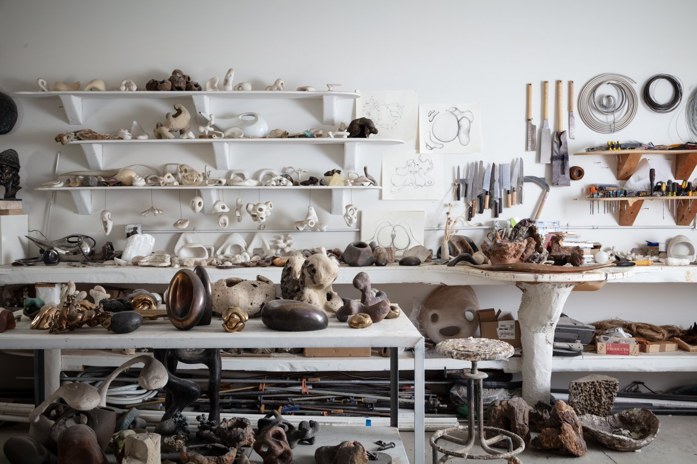
While Gregory’s gallery/showroom, R & Company, displays a curated selection of the artist’s finished work, his studio is like a mash-up of sculptor’s atelier, archaeologist’s lab, and cabinet of curiosities. The assemblage of chairs, tables, lamps, sculptures, objects, and works-in-progress illuminates both the free-range imagination of their maker and the power of his pieces to elicit anthropomorphic projections.
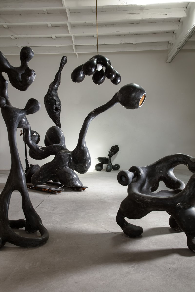
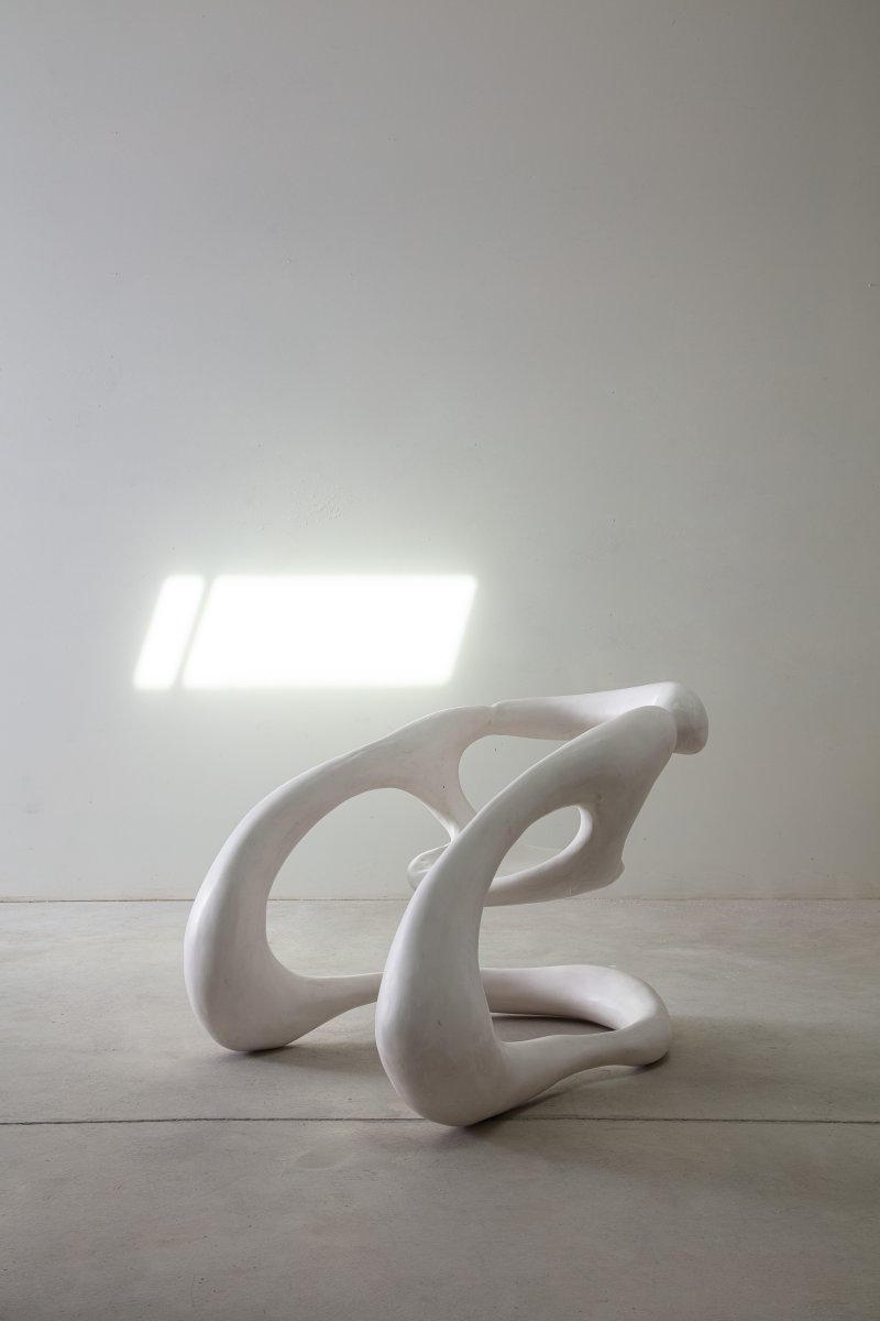
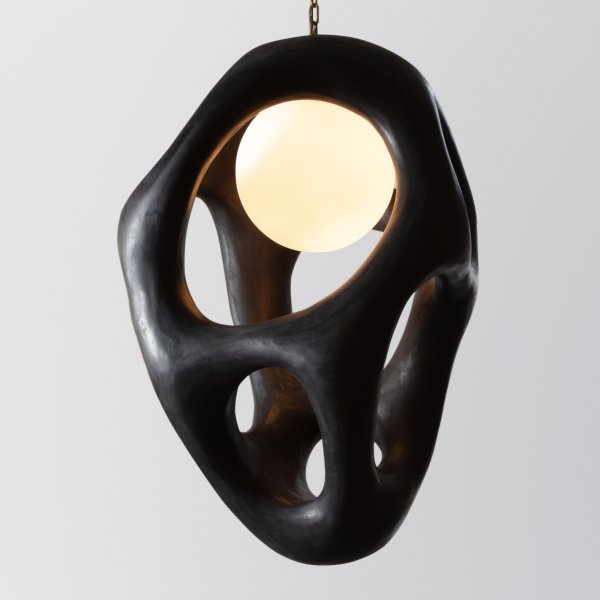
Some objects gesture toward animals, others at primordial plants, and several evoke hybrids of both flora and fauna. A chandelier with multiple arms blooms and hovers from the ceiling like a many-headed hydra. The textured seat of a splay-legged stool is gently rounded in the manner of a tortoise’s back. And a flock of crook-necked bronze Dune lights peer inquisitively toward a monolithic Venus of Willendorf. Some forms conjure desert-bleached bones; others, excavated artifacts or floating tendrils of kelp. And many pieces evoke humor—such as floor lamps that appear poised to break out in a Merce Cunningham solo. By marrying his imagination and reverence for nature with his fabrication prowess, Gregory creates pieces akin to the love children of Dr. Seuss and Isamu Noguchi.
I recently had the pleasure of chatting in person with Gregory about his work, his philosophy, and his belief in the power of curves to connect us to the natural world.
You’ve said that you hope for your work to evoke joy and emotion, which is not the response elicited by most mass-produced or custom furnishings. Although your works vary in scale, materials, and function, they all eschew right angles, by design. Are they intended as biomorphic correctives to the tyranny of our rectilinear built environment—like a connective tissue to the emotive shapes found in nature?
RG: Yes, and yes. The most efficient way to lay out a city or to build a structure is a square box or on a grid. However, it’s not the most livable—and there’s a whole science around this. Even going for a walk, there’s a difference between moving in a straight line and meandering along a curving path, which is really good for the brain.
For me to carry on doing what I do, I need to have some raison d’être. And my life thesis is that we were not meant to be living in square buildings, sitting in rooms surrounded by flat surfaces. We didn’t evolve that way and I don’t believe it’s good for us. It’s not like I was one day thinking, You know what the world needs? More round stuff! But there’s something about being in the presence of these shapes that is therapeutic and beneficial—and so nothing in my work is symmetrical and there are no straight lines.
I’m not particularly optimistic about what we’re doing to the planet. But my contribution is an aesthetic one, and I can hope that these anti-synthetic forms—which are not made on a quadruple-axis milling machine but by human hands—might have some kind of impact.
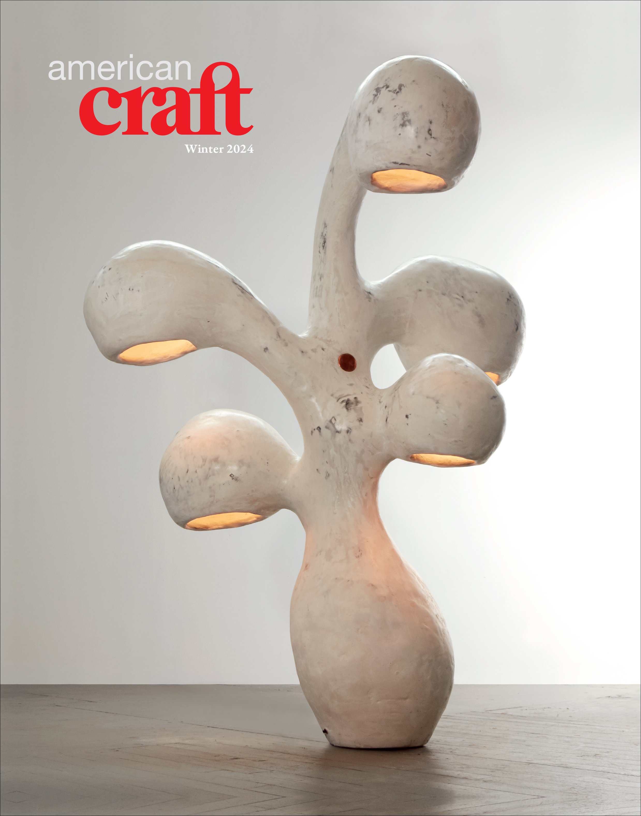
The cover of the Winter 2024 issue of American Craft features an untitled lamp from Rogan Gregory’s Fertility Form series, 2019, gypsum and copper, 77 X 47 X 60 in.
