Dreaming in Color
Dreaming in Color
Interior designer Agnes Bourne carries three different business cards, each with a distinctive tagline. When she meets with a client the first time, she invites them to choose the one they like best: “Design Matters”; “Design is a plan for arranging elements in such a way as best to accomplish a particular purpose,” a Charles Eames quote; or “You’ve got to be kidding!”
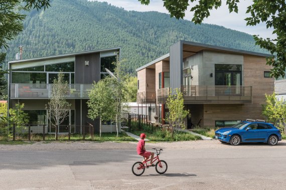
The latter is the most popular pick – and the one that resonates most for Bourne. As the phrase suggests, openness and wit are integral elements of the creative philosophy Bourne practices and lives. Design as play has always motivated her; as a child, she spent a day home alone building a house of sticks for her siblings’ stuffed animals (to the irritation of the siblings). It’s a memory that speaks not only to her signature aesthetic, but also to her desire to create in concert with nature, reflecting the textures, colors, forms, and creatures found outdoors. Bourne lives in Jackson, Wyoming, with her husband, Stuart Plummer. It’s an ideal backdrop for the wonderland she has assembled indoors.
As a designer, you communicate through color. What color concepts are expressed in this house?
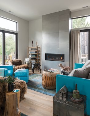
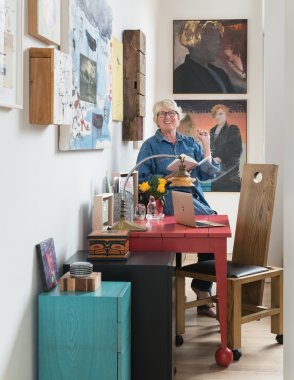
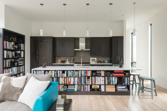
In each room, I present one color in various forms, contrasted with natural textures and the absence of color. In the great room, the color is turquoise blue, which represents the wild blue yonder and emphasizes being fresh, open, and curious, mixed with humor and fun – freedom! In my office, the color is red – the red desk is by artist Max Leiber. Red is “Wake up!” Red is excitement, red is warmth, red is “Ah, what’s next?” There are tiny red bits all the way through the house, but never so much that you get tired or saturated; instead, you’re happily stimulated.
You took a different approach to the bedroom, though.
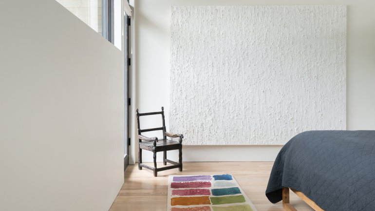
Yes, there is no color there except for the suggestion of the possibility of creativity in the rug that looks like a carefully arranged artist’s palette. This absence of color makes the room open to dreaming. It clears your mind. It also emphasizes the big bay window that looks out onto the mountains. This becomes the natural art of the room, allowing a focus on the moon and stars at night and, at other times, the sunrise, weather conditions, and birds.
It all comes back to color, which is then light, which is then energy. Inside each of us, we have the primaries, the secondaries, and the blends of these colors. It naturally occurs within our own personal energy.
How does your approach translate to your work with clients?
At the beginning of a project, I ask myself and my clients to think of their space and what matters most to them. We start by talking about their favorite memories related to places and things. And then I encourage them to write a haiku and a list of feelings and values; those are words we then reference when we make subsequent decisions. This exercise sets the spirit of the project.
It really does work. For one client, when their friends first walked into their new house, they said the words: “Oh! This house is joyous! So welcoming and loving.” Those had been the couple’s guiding words. Speaking your reality, speaking your environment into being, is absolutely possible.
What words guided you in the design of your house?
When I saw this house, I wrote two haikus:
The butterfly sings
Rain dampens fertile brown earth
Blue ribbons flutter
Horses dance lightly
The dawn glows on mountaintops
Hearts connect in tune
And a word list: Freedom, joy, communication, curiosity, creativity, generosity, clarity, and passion. The words and haikus have remained the mottoes for the house. We have room for guests in the studio apartment, and I use it all year long as a residence for family members and artists in residence teaching at the nearby Center for the Arts and Teton Artlab.
Designing a house, including the interior space, closely resembles crafting a piece of art. You consider the same elements. To quote artist and teacher Nicholas Wilton, the piece should include “design, value, color, texture, risk, and soul.” Add to that narrative or story, and you’ve created the basis of the work.
Your interiors unfold as narratives. What are some stories told within this space?
Every single thing in this house has a story, a poem, or a history. The drum that is the coffee table still works as an instrument. It’s made from a 200-year-old cottonwood tree. Another cottonwood, cut down a couple years ago, became the side tables next to the yak chairs.
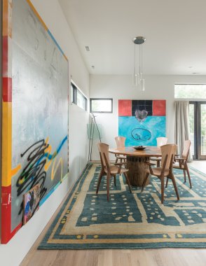
There are multiple expressions of wood. The chairs around the dining table are by Brian Boggs from North Carolina. I met him here in Jackson at the Western Design Conference. Not only are these chairs ergonomically perfect, but they are funny; they have a sense of humor. There are innuendos in the three different woods he used. The edges of the seats and backs are not squared. They have subtle variation in line. The front of the arms are carved very gently. You can feel them giving sweetness to the hard surface, like little bites in the wood.
It’s like sitting in the yak chairs; sometimes when I have meetings in the house, colleagues sitting in the yak chairs start caressing them, like they have a pet in their laps. The yak chairs tend to soothe a conversation. They reflect my passion, and their softness contrasts with the metal fireplace façade as well as the silver painting across the room. I live in nature with love and respect.
Can you do a walk-through of your house, explaining your design-as-artwork approach?
When I go into a room, I see dark, light, and middle values. I see textures. I see complementary components. I see the potential of stories. I see line. I see mass. I do an oval eye-tracking around the space. It’s a labyrinth, not a maze; the difference is enormous. I’m not getting lost – I’m being guided. So many interiors are a maze. You’re just confused: Where do you look next? What do you feel next? You want to run away.
A limited palette becomes a guide. Take the blue in the living room: It’s super-saturated in the turquoise, but on the floor, it’s more muted. The values differ, but they come from the same source. The variety within the simplicity balances. Color, brought in as paint, fabrics, man-made things, lives comfortably with natural elements.
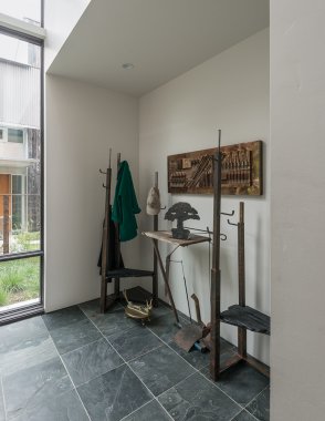
In this house, the natural surfaces vary, from the furry yak to the smooth finish on the wood chairs Brian made and the metals that serve as structural and sculptural accents – wrought iron, brushed steel, bronze.
The bronze figures in the kitchen represent emotions. I call one Kerfuffle: A bull elk has bucked off a cowboy. It’s a true story of a person who lived here in Jackson, who tamed a bull elk to wear a saddle, and he rode it for years. It took something for the human and the creature to be able to be friends. It happened, and it lasted. The bear down at the other end of the counter, Dearly Bear, is the epitome of generosity and love. In Wyoming, the stories go on and on.
