Craft in the Abstract
From American Craft Inquiry: Volume 1, Issue 2
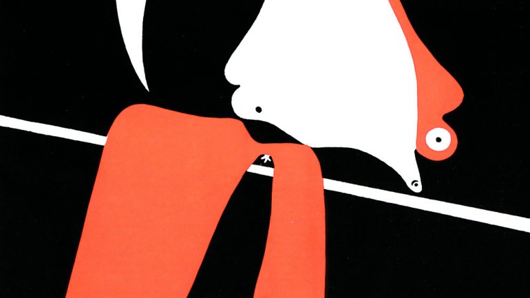
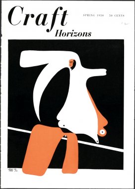
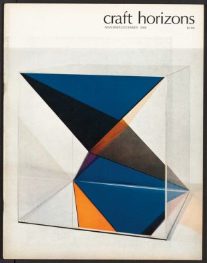
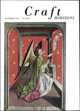
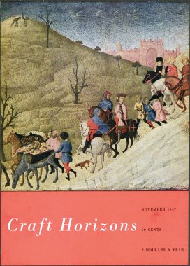
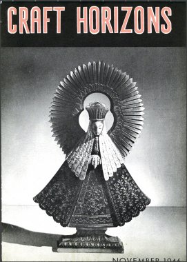
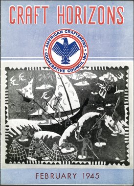
Visit the American Craft Council’s digital collection of Craft Horizons, peruse them in chronological order, and you’ll find that the design trajectory across its four decades in print is immediately apparent. Start with the first few issues, which were published during World War II and look like bulletins from a government agency or humanitarian organization. Soon, photography is introduced – but only in black and white, and the covers retain their austere, imposing logo, a stylized eagle with its wings spread wide. Scroll a bit further into the late 1940s, and suddenly Renaissance paintings and Mughal miniatures bloom in full color. Then, in the spring of 1950, something very different appears for the first time on the cover: abstraction. A red, white, and black stencil by the Spanish avant-garde painter Joan Miró. It has all the curves and swagger of a piece of studio jewelry by Art Smith; a Renaissance painting it was not.
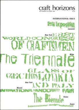
New subscribers receiving their first issue in 1950 perhaps gave this little thought. But taken in the context of the magazine’s previous graphic style – and indeed, the wide-ranging content and imagery it would continue to publish until 1979 (after which it was renamed American Craft magazine) – this issue clearly marks a pivot point away from the literal and towards something more complex and open to interpretation. Why is it important? Before the digital networks and proliferation of media available today, Craft Horizons was a kind of intranet for the craft world of its time. The way that its editors chose to communicate its point of view, telegraphing its views graphically to its readership, had a profound effect on the community it served. The evolution of Craft Horizons’ graphic identity throughout the 1950s and ’60s reveals real connections that it was forging with the fields of photography, advertising, filmmaking, fine art, sculpture, and craft practice, all unfolding against the backdrop of booming postwar America’s bohemian understory. It ensured that the craft world, like any creative community, was not isolated from other artistic movements or popular cultural phenomena; it was both adjacent to, and in the thick of, all of them.
Perhaps not coincidentally, the November 1948 issue of Craft Horizons is the first in which the artist and graphic designer Sydney Butchkes is listed on the masthead as the art director – a role that had never been noted in print before in Craft Horizons, if it existed at all – but he had been working with editor Mary Lyon in some capacity at least since 1947.1 His first few years on the job, working with Lyon to bring color and graphic verve to the magazine, yielded something that looked less like the austere newsletters of the publication’s early years and more like a genteel museum bulletin. But where earlier covers had featured high points from Western art history, soon enough his efforts began to reflect his interest in abstraction. Butchkes came to New York to study at the Art Students League and the New School before serving in World War II. He first made a name for himself designing album covers for Columbia Records, and he illustrated several iconic book covers, including Jean Kerr’s Please Don’t Eat the Daisies, which was published by Doubleday in 1957.
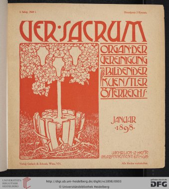
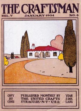
Even before its graphic makeover, Craft Horizons was unique. The craft periodicals that came before it were associated with particular aesthetic points of view, and their styles reinforced them. Gustav Stickley began publishing The Craftsman in 1901, and the Los Angeles architect Henry Wilson launched The Bungalow in 1909. Both magazines championed Arts and Crafts furniture, and cozy Craftsman cottages with tiled fireplaces, offering architectural plans, articles about technique and design, and appreciations of historical craft and decorative arts movements of interest. In Austria, Ver Sacrum (Latin for “Sacred Spring”) was the exquisitely beautiful magazine of the Vienna Secession movement, of which Gustav Klimt was a founder. Published from 1898 through 1903, it featured lush, almost proto-surreal illustrations, most of which were by graphic designer Alfred Roller a champion of Jugendstil. His design pushed the imagery of flowers, plants, and the female form into the nearly unrecognizable territory of abstraction.
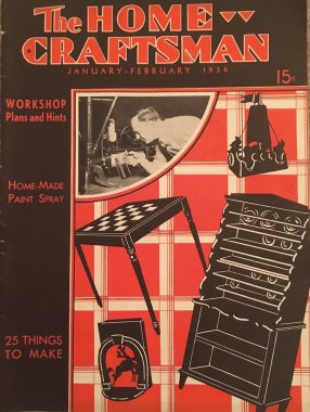
In the United States in the 1920s and ’30s, the burgeoning hobby craft movement introduced periodicals with a more explicit do-it-yourself bent. Magazines for women, such as Needlecraft and Stitchcraft magazines, took up where the Victorian Godey’s Lady’s Books left off, offering the modern woman patterns for clothing and household necessities she could make herself. The Home Craftsman and Deltagram, a magazine published by Delta Power Equipment Corp. starting in the 1930s, offered readers plans and ideas for furniture, decorative objects, and novelty items including chess sets, doll houses, and miniature boats. There was no conceptual framework about craft’s meaning in society or any particularly aesthetic concerns reflected in the pages of these publications, apart from an emphasis on affordability and practicality as the Great Depression wore on and relative simplicity where construction was concerned, so that hobbyists could master featured techniques. Skill, as understood in Stickley’s turn-of-the-century Craftsman world view, was relatively rare, and something to be revered and admired. In the world of The Home Craftsman, skill meant being able to follow directions and produce a finished product that matched an illustration. Creation did not mean creativity, and whimsy did not imply eccentricity; it merely indicated the dutiful echoing of a kitschy sensibility that aimed for broad visual appeal.
During the period in which Americans were fascinated by hobby magazines, the Bauhaus and like-minded designers across Europe were embracing futurism, abstraction, and constructivism, introducing an avant-garde look to public housing projects and popular advertising campaigns. Le Corbusier, Pierre Jeanneret, Charlotte Perriand and A. M. Cassandre in France, Fortunato Depero in Italy, and Walter Gropius, Josef and Anni Albers, Mies Van der Rohe, Marcel Breuer, and Laszlo Moholy Nagy in Germany, among many others, believed that Modern design had a social obligation to fuse the accessibility afforded by mass-production with the thoughtfulness of handcraft and architecture. Particularly following the First World War, Bauhaus designers dismissed the Arts and Crafts view that industry was irredeemable in favor of a utopian belief in its potential to bring high quality design to everyone. Modernism, and increasingly, abstraction, had politics.
World War II sent scores of designers from the Bauhaus and elsewhere in Europe to the United States, where they would work and mentor generations of American designers for decades. The influx of emigres from Scandinavia, France, Austria, and Germany in particular, left such a profound effect on American design that its influence is almost impossible to tease out. One of their imports was the idea that craft could be avant-garde. So, where Craft Horizons began its tenure documenting the traditional and vibrant crafts of the United States, largely in rural areas, and doling out advice from society decorators and curators at major museums, the magazine’s aesthetic and conceptual about face in the 1950’s and ’60s reflected a new way of understanding craft practice and crafted objects—one which was in dialogue with rather than cut off from the parallel worlds of contemporary art, advertising, and film.
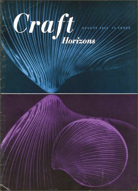
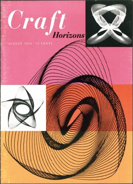
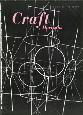
By the mid-1950s, Craft Horizons began regularly putting abstract designs on its covers, and did so in line with the design trends in magazine publishing. Abstract and highly stylized designs could be found on the covers of a range of periodicals during this period of both the general interest and highly specific sorts, from Fortune to Domus, Arts and Architecture, and even Ceramics Monthly. The June 1952 cover of Craft Horizons featured a wire sculpture called Aerial Act by Richard Lippold, which was starkly lit against a black background. Absent any context, the image is mysterious, and could be any size, or made from any material. In August 1953, glass shells by the Finnish designer Tapio Wirkkala were dramatically lit and shown in closeup, so that their shell-like form is only visible after a long look and some thought. And in August 1954, the cover featured a vibrant pink, red and orange illustration of a “Lissajous figure” (which resembles something like an eccentric Spirograph pattern) in August 1954. This cover highlighted an article by Robert Beverly Hale called “Passions and Pendulums,” which explored the relationship between this complex curved forms and aspects of contemporary sculpture and architecture. If Craft Horizons was aiming to reach an audience of practical-minded hobbyists, it was going about it in a curious fashion.
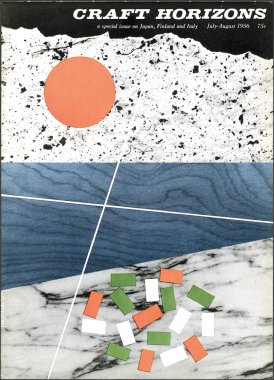
The implications for the new abstract style were myriad: The visual language of abstraction was artistic, but it was also one of class. The implied readership of this periodical was thus deemed sophisticated enough and sufficiently fluent in visual metaphor to reconcile their tactile interest in crafts – making or collecting them – with the patterns and designs that gave Craft Horizons its postwar flair. Cementing the fledgling magazine’s new look were Ivan Chermayeff and Robert Brownjohn. Hired as designers the two were major talents in New York’s graphic design orbit in the 1950s and ’60s, which included luminaries such as Saul Bass, Paul Rand, and Alvin Lustig. Chermayeff and Brownjohn brought the design in line with contemporary trends and redesigned the logo. Their first cover, in 1956, was an homage to the flags of Finland, Japan, and Italy, and used material cross sections to effect abstract renderings of each country’s symbols. Brownjohn would go on to design the cover of the Rolling Stones’ album Let it Bleed, and opening titles for the James Bond films From Russia With Love and Goldfinger, while Chermayeff’s firm would design logos and identity systems for Mobil, Pan Am, the National Geographic Society, and many other major corporations.2
In 1959, Rose Slivka, who had been associate editor since 1955, took the helm of Craft Horizons; it was under her leadership that the content of the magazine would come into even more robust dialogue with its experimental graphic identity. Having worked at magazines including Mademoiselle, Glamour, and Holiday, Slivka was deeply knowledgeable about contemporary graphic design and publishing trends. She also came from a world, she wrote, in which “craft was everywhere.”3 Her husband, David Slivka, was a sculptor who sometimes worked in clay, and her mother was an accomplished weaver and worked as a textile conservator at the Metropolitan Museum of Art. She spent time with other artists working in an abstract expressionist milieu; she noted that sculptors were making pots, painters were making jewelry, and, in general, cross-disciplinary experimentation was animating the creative communities that formed New York City’s thriving avant-garde.
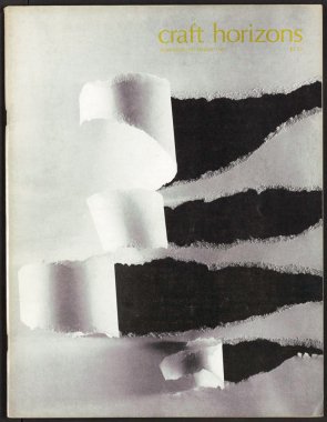
Her interest in expanding the métier of Craft Horizons often spotlighted the activities of the Museum of Contemporary Crafts (now the Museum of Arts and Design) which, like Craft Horizons, was decidedly ecumenical in its sense of what “craft” could mean. Known for its thematically and visually ground-breaking exhibitions, particularly those curated by Paul J. Smith during the ’60s and ’70s, the museum did much to bring craft into a larger cultural conversation. The 1968 exhibition “Made with Paper,” which had support from the Container Corp. of America, included objects made from the material, as well as participatory elements: Visitors were asked to wear paper shoes while viewing the exhibition, and they could walk across modular, three-dimensional paper floor units, for example. The conceptual artist James Lee Byars lead a performance piece in which paper was laid out on 53rd Street and then dissolved and washed away by city street cleaners. To symbolize this content in the magazine, the November 1968 cover featured nothing but a sheet of white craft paper, with four carefully torn areas exposing a black background.
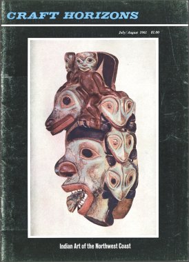
Slivka ruffled feathers by casting a wide net across materials and areas of creative practice for Craft Horizons, but she also did so within traditional material disciplines of the field, most notably ceramics. In July 1961, the magazine published what remains one of her most widely read and well-regarded essays, “The New Ceramic Presence.” Here, she cast light on sculptural work by Peter Voulkos, John Mason, Robert Arneson, Stanley Rosen, and Harold Myers, drawing connections between the United States’ muscular postwar industrial landscape and the powerful physicality of these new ceramic forms. Letters poured in. The furniture designer Wharton Esherick liked it. The Bauhaus-trained potter Marguerite Wildenhain did not. “Quit corrupting the young generation with your fake double standards,” Wildenhain wrote: “Nobody in his senses can continue to subscribe to Craft Horizons, supposedly the magazine of the ACC, without blushing with shame or getting blue with fury.” Ceramist Warren Mackenzie didn’t like it either, and his assessment was that the sculptural work was on a level playing field, conceptually and artistically, with the sort of “found objects one would encounter in a heavily trafficked cow pasture.” Wildenhain would, some years later in 1977, reject an offer from the ACC to become a Fellow, citing among other sins, the Council’s “horrible magazine.”
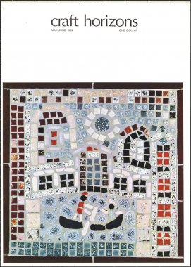
Experimentation is not for everyone. Craft Horizons covered its share of traditional craft practices, and likely alienated some of its readers by covering exhibitions featuring Space Age garments and articles on the wonders of plastics as early as the 1940s. It aimed to keep tradition alive in the postwar world, but pivoted to become inclusive, both thematically and graphically. The abstraction it embraced, from futuristic Lissajous figures to torn paper, signaled to existing and potential readers that craft’s own horizons, at least as far as the ACC was concerned, were broad and ever-expanding.
Read more from the second issue purchase issue
1. In her book, American Studio Ceramics: Innovation and Identity, 1940 to 1979, Martha Drexler Lynn indicates that Mary Lyon took over from Aileen Osborn Webb and redesigned the magazine with Sydney Butchkes in May 1947 (p. 80).
2. Brownjohn studied with László Moholy-Nagy in Chicago at the New Bauhaus (ITT) and they experimented with projecting moving images on other surfaces. This technique or idea inspired Brownjohn’s ingenious use of projection for the opening titles he designed for the James Bond movies.
3. Elizabeth Essner, Meaghan Roddy, and Lily Kane, “The Good Making of Good Things: Craft Horizons Magazine 1941-1979,” exhibition catalogue essay, the Center for Craft, Creativity & Design, Asheville, NC, 2017.
