Capital Improvements
Capital Improvements
The Washington Glass School isn’t a nonprofit – but it’s not a for-profit, either. As a community entrepreneurial business, the school sustains itself and its outreach programs by applying for public art projects. This July, the staff is slated to complete its most prestigious work yet: doors for the Library of Congress John Adams Building.
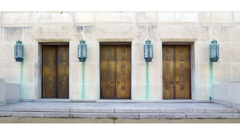
The original doors were designed in 1939 by Lee Lawrie, the sculptor whose Atlas graces Rockefeller Center. They’re massive bronze works, depicting 13 mythological and historical figures of language and learning. Over time, they had begun to fail, straining at the hinges, and didn’t meet modern building codes. Rather than altering the historic doors to address these issues, the Architect of the Capitol made a bold decision; in addition to conserving the Lawrie doors, they would reinterpret these unique Adams Building features in glass.
WGS co-directors Tim Tate and Michael Janis tell us more.
With historic structures, restoration seems the obvious route. How did this project come to be?
Tim Tate: We have free classes here. We do it to give back to the community; we never anticipated it would be a karmic thing. And in one of those free classes, one of the people who attended grew up to work for the Architect of the Capitol.
So the moment of genius didn’t come from us. It came from that one person who had taken a class here 12 years ago, who had a lightbulb come on in his head. Who said, “We could take existing bronze doors in a building as historic as the Library of Congress and translate them into a new medium.”
That moment had to be hard for someone used to historic preservation. That’s a big leap for anyone to make.
As artists, how did you approach the commission?
Tate: We realized that the best place to do these panels would be Portland, Oregon. We’d be close to Bullseye [Glass Co.], so we’d have easy access to the glass, and Ray Ahlgren, one of the founders of Bullseye, has a studio there that was made for this. We could have adapted our studio, but we decided that on such a historic project we should involve artists from across the country as much as humanly possible.
Michael Janis: And not only glass artists. The molds [of the original doors] were done by Sean Hennessey and Marie Schneggenburger, for example, who have an arts theater [and prop-making] background. All of the people involved saw it as a way to showcase the best of the best. You’re leaving a legacy to the United States by saying you worked on a door of this scale.
Tell us about the re-creation of the doors.
Janis: There are a lot of mundane things that go into a door – panic bars, security concerns – all sorts of practical and functional things that change the grand vision.
The original bronze doors also have a stepped pattern, while the redesign called for a flat plane, so some of the texture has been modified a bit. Some of the figures were chopped off the way that the panels divide, so the question came up: Do we try to interpret where the rest of the design would have been? And the answer was to leave it exactly as is; we’re referencing those panels and those doors. And that’s what we took castings of.
Can you describe the glass?
Tate: The panels are cast in a clear, iron-free Bullseye architectural glass. Those are then laminated to green iron float glass. That’s one of the requirements for a door, architecturally, that it has to be laminated to a piece of tempered glass.
Janis: Personally, I think the greenish tint that comes from using float glass is a benefit. Since the panels will be surrounded by bronze and the color of the original building, it works to enhance the glass. More than being just clear – it has presence.
Tate: The glass is also just as beautiful from the back.
Janis: The first time we made a sample and held it up, that was when it really struck home as to what this was going to be. The original doors just give you a blank interior. Suddenly now the sculpture will also be on the inside of the building.
What’s your proudest moment thus far?
Janis: Having an architect’s background, I like all aspects of it; the sense of history. I’m contributing in a way that my whole background ties into.
Tate: For me it was unpacking the panels and seeing the kind of epic quality – and also working with the Architect of the Capitol’s office, which has been spectacular. This project is their legacy and our legacy. The moment we saw the panels, though, we were blown away.
My own artwork can be, you know, challenging at times for someone who doesn’t know the contemporary art world that well. But anybody can come and see craftsmanship and the beauty of these panels without any extra education about what they are about or how they are made. They’ll know that these are magnificent.
Julie K. Hanus is American Craft’s senior editor. Perry A. Price is the American Craft Council’s director of education.

