Make Room Designer Spotlight: Stephanie Fillbrandt and Chiya Ewald
American Craft Show in San Francisco
What's your company name? Marsh & Clark Design
What's your favorite design tip?
Start with your favorite color and use it in different percentages throughout your house. Cut it by 50 and 25 percent and play with different sheens. You will feel the variation and dimension, but it will also feel incredibly sophisticated.
What color did you choose and why?
We chose white. White is the perfect gallery backdrop for the showcasing of any piece of art, and we wanted the crafts to be the focal point.
What’s your vision for the space?
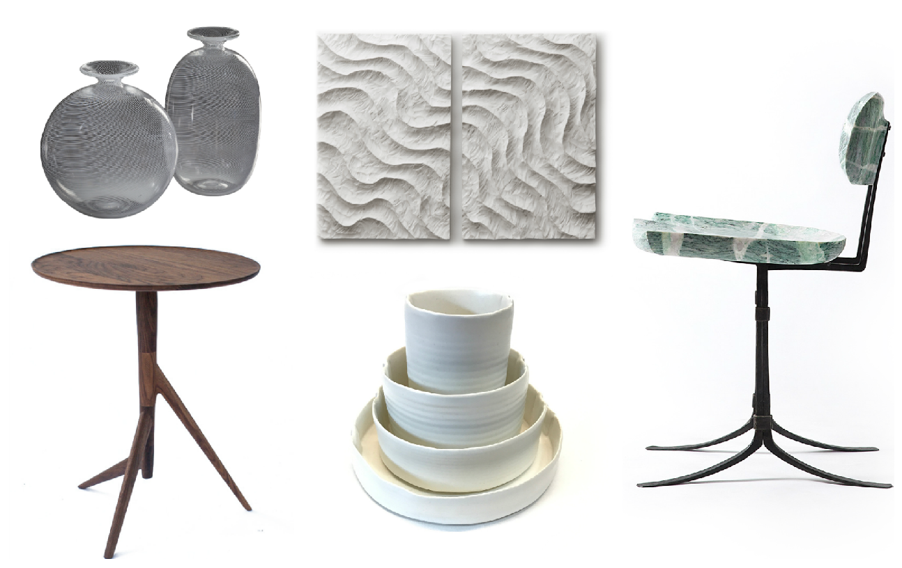
To use our favorite design principle, which is the subtle repetition of shape as a way to simultaneously highlight the uniqueness, and tie together the artisans’ works.
Who are your ACC show artist picks and why are you featuring those particular objects?
- Erickson Woodworking: We were drawn to the beautiful lines of their furniture. The gracefulness of the shapes in the chair – paired with the hard materials used to fabricate it – translates into a perfect balance of feminine and masculine.
- Matthew Yanchuk: The ceramics have a raw, yet delicate, feel to them.
- Kevin Costello: We liked the flexibility of the Twig side table. It is both architectural and playful, allowing it to be appropriate as an artful accent in a formal living space or a side table in a more casual setting.
- Joe Graci: Joe's panels are sculptural in nature and create amazing shadow and texture that can turn an otherwise plain wall into a statement.
- Dave Strock: We thought Dave’s glass pieces were a beautiful juxtaposition to the room with their perfect symmetry and shine.


